


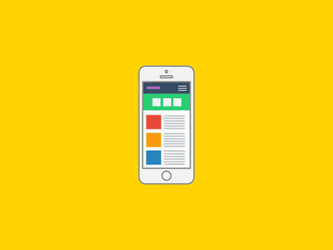
If your website is not mobile optimized or mobile responsive, you are losing business to your competitors. How many times have you visited a website on you 5" smartphone screen and had to pinch to click on a button, then oh wait, you clicked on the wrong button! You're more than likely frustrated and wanting to leave the site and look elsewhere for what you're wanting.
Here are 3 ways to make your website mobile friendly.
- Use responsive website design.
Millions of web users’ access internet through their smartphones, phablets and/or tablets and a responsive design ensures your site conforms to any screen size or device. No matter what the size of the device your visitors used — smartphone or tablet — you have a website that is similar to and consistent with the desktop version.
- Use mobile plugins on known CMS platform
If you already built your website on popular platforms like Wordpress, Drupal and Joomla then you can use available plugins that can make your desktop website mobile friendly. These plugins can even let you customize the user experience and add other features best for mobile devices.
- Create a mobile version of your site on a different domain, subdomain, or subdirectory from the desktop site.
This method requires you to have two separate websites – one for desktop design and domain while other is for mobile design and domain. This is the simplest way to have a mobile version of your site, however, this is least recommended by Google. Although Google supports multiple mobile site configurations but using this method increases the amount of work needed to maintain and update your website and more likely to encounter technical problems. Instead of having multiple sites, you can simplify your work by creating a responsive website design which is Google’s recommended configuration.