Some landing pages are crammed with so many elements such as too many buttons, details, colors, links, etc. This kind of landing page will drive customers away and lessen the conversion rate and revenue. Once the visitor reaches on a landing page, it’s your work to hold them there.
Your landing page has one goal: promote the single offer. When a visitor arrives at your landing page, he comes with a particular purpose in mind: he wants to avail the offer. Adding extra links other than call-to-action of the proposal might divert the visitor's attention from availing the offer and decrease the chance of converting them into leads or customers. One of the best ways to increase your landing page conversion rate is to remove additional links; even the main navigation links, remove it on your landing pages.
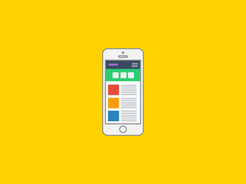
What Are Main Navigation Links?
Main navigation links are usually placed at the top of the page and ordinarily features the most important links of the website, like Home and Contact. Here is what a navigation link looks like:

Businesses are starting to remove the main navigation links on their landing pages, and you should do it too. An experiment conducted by Hubspot, Yuppiechef, Career Point College, and SparkPages shows a dramatic increase in their conversion rates a month after removing their top navigation links. Here is an example of landing page without a main navigation.

How To Remove The Main Navigation Links on Landing Pages?
Removal of the top navigation depends on the landing page platform (platform such as Wordpress, Joomla, Drupal, or using a landing page builder like Hubspot and Unbounce) you use. Contact your head website developer/designer to discuss this option, or you may contact us to do it for you.