A call-to-action (or CTA for short) are gateways from converting a visitor a lead. It asks something of your visitor to do like a next step after a blog or reading info or seeing stats etc. So how do you keep a CTA asthetic and noticable?
How To Make CTAs Stands Out
The intention of creating a compelling call to action is to make it stand out in a way that it also not overwhelm the rest of the page. So, to make it naturally appear noticeable on your page: use a color that is distinguishing to your website theme. I don’t mean it has to be neon colors, fluorescent, flashing lights, and sirens but it has to be something prevailing colors especially for the buttons and link text. You want visitors to notice it instantly, so it must be something that doesn't blend with the design. Remember that colors provoke certain emotions and can lead people in your favor, making it the quickest way to grasp someone’s awareness.

If your call-to-action blends with your site design, then people will assume that it's a part of your view and won’t take action to click it. Instead of camouflaging your CTA, utilize it to make it clear and clickable.
Offer Based CTA's
You may see buttons such as Free Download, Get My Free Ebook, and Free Grabs, these are samples of an offer based CTAs that are utilizing enticing words in button to emphasize offer’s value proposition. A piece of advice, if you’re going to use graphics on offer based CTAs, make sure that your icons don't perplex the offer for users.

Download CTA's
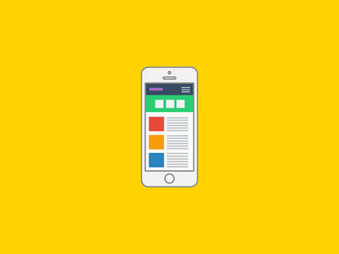
Here are some free call-to-action templates from Hubspot with no acknowledgment needed, just download and use.